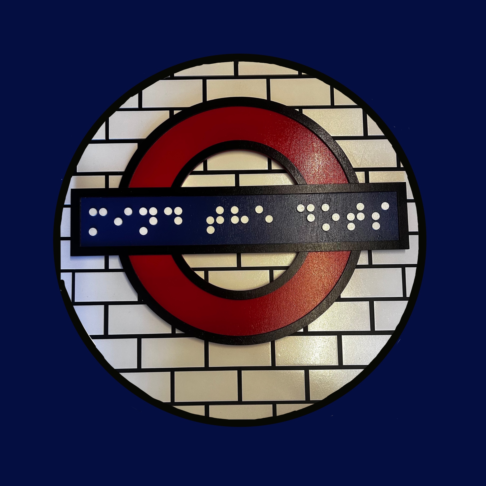
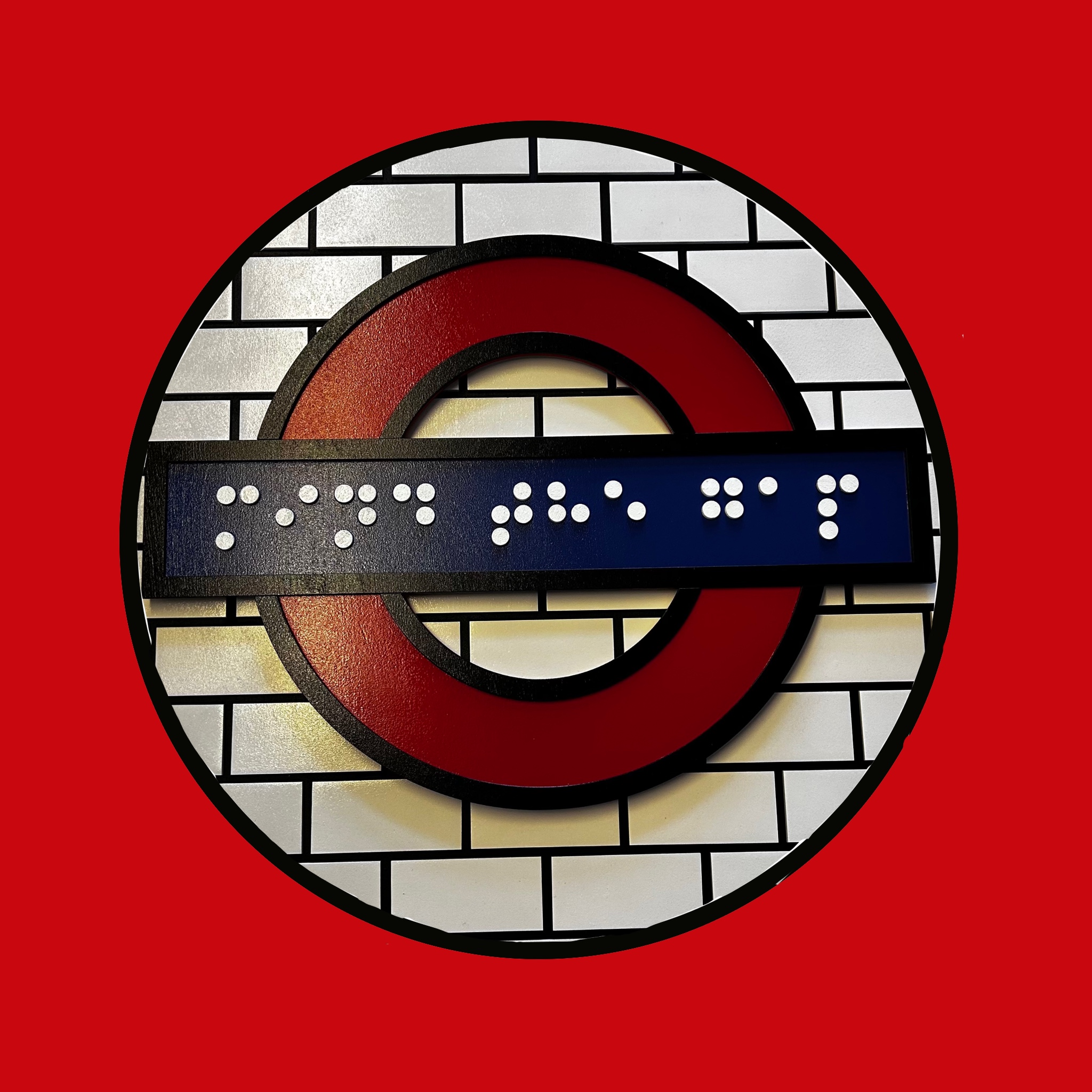
Mind the Dots
This piece takes one of London’s most iconic visuals – the Underground roundel – and reimagines it through the lens of accessibility. The familiar phrase “Mind the Gap” is flipped into “Mind the Dots”, a sharp and ironic statement that highlights a glaring truth: despite billions spent on modernising the Tube, even with the brand-new Elizabeth Line, braille is still nowhere to be found across the network.
Why should we be asked to “mind the dots” when there are none to mind? This work draws attention to an overlooked failure in inclusive design. The London Underground, a global symbol of connectivity and movement, remains inaccessible to many blind and visually impaired passengers.
Now imagine a series of these signs stretched across the entire Underground, each recreated in the colours of their respective lines. They wouldn’t just be beautiful pieces of public art – they would be functional, tactile guides that finally give braille a rightful place in the city’s fabric.
Mind the Dots is not just a piece of art. It’s a call for equality, for visibility, and for change.
Share This Story, Choose Your Platform!