Love Dots, Hates Dots
Marmite in Braille: A Taste of Accessibility
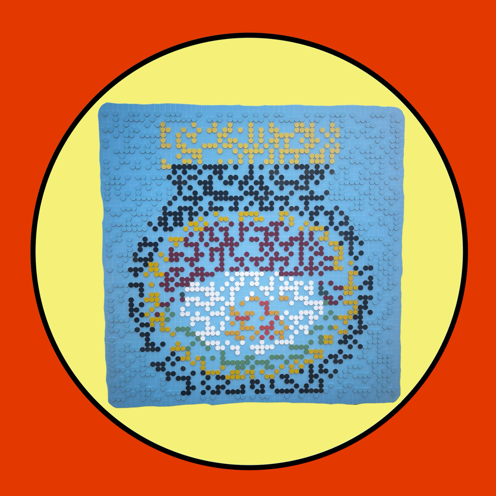
We live in a world dominated by brands and colours. Walk into any supermarket, and your eyes instantly recognise iconic products—not by reading their names, but by their bold, unforgettable colours. Marmite is one of those icons: instantly identifiable by its yellow, red, and black palette.
But what if you couldn’t see those colours?
For someone who is blind or visually impaired, shopping becomes an obstacle course of inaccessibility. Packaging that screams its identity to sighted shoppers is silent to those who rely on touch.
This artwork—Marmite in Braille—reimagines the iconic jar in tactile form. Each colored dot represents Braille, turning something visual into something touchable. It’s more than art—it’s a statement:
Accessibility should be as iconic as the brands we love.
Let’s build a world where shopping isn’t just for those who can see.
Where Braille, audio cues, and inclusive design make independence possible for everyone.
Share This Story, Choose Your Platform!